Up next / First Dance
Previously / Eternal Ecstasy
Ever since I can remember, I’ve always been interested in drawing and painting. I would always try to make those mediums look photorealistic. The first time I remember using photography as a medium was the 1992 Motor Show. I borrowed my fathers Pentax Asanti. I remember shooting the TWR Le Mans XJ220 at the show then spending weeks drawing the car from the photos.
I guess the photography although I’ve only started to take it more seriously in recent years. Becoming a CG artist was a progression from striving to create photorealistic paintings. It is essentially just a tool like anything else, of course it’s a lot easier to get a good result now than it was 18 years ago.
I don’t think a single Photographer has influenced me over any other. There are several photographers who’s work stand out to me but I try not to look at their work when creating my own as I don’t want to be too influenced by what others are doing right now. I look at a lot of vintage photos and film and try to analyse what gives them the evocative nature. A lot of the time it’s the absence of a specific colour that creates a limited palette.
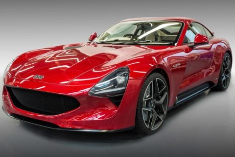
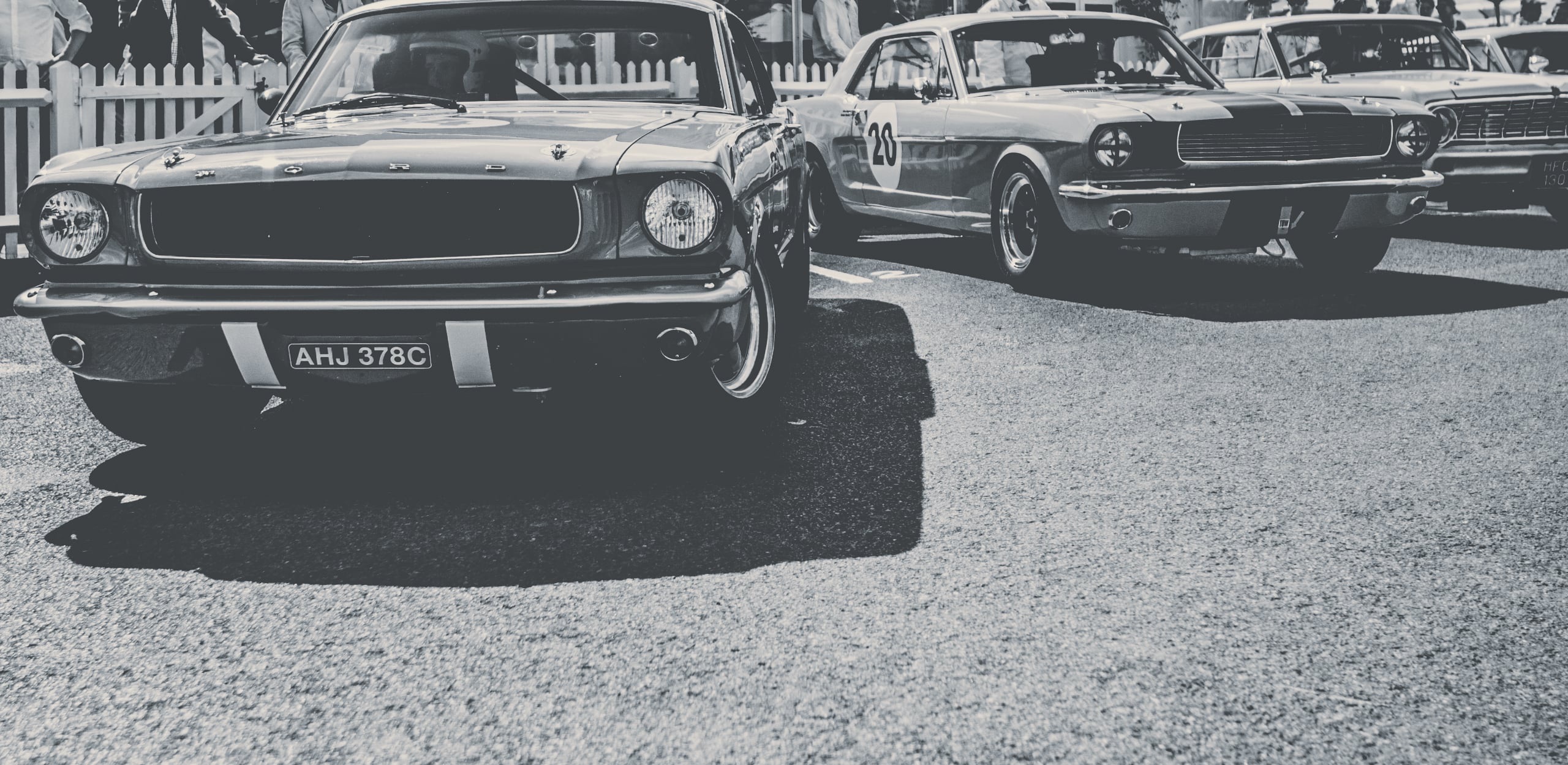
There are two styles I like to shoot. The first is quite graphic, tight crops and lots of clean space around the subject. The second is to get as close to the action as I can, I like the idea that I’m that close but I’m not allowed to be. I try to convey that in my framing.
“I look at a lot of vintage photos and film and try to analyse what gives them the evocative nature. A lot of the time it’s the absence of a specific colour that creates a limited palette.”
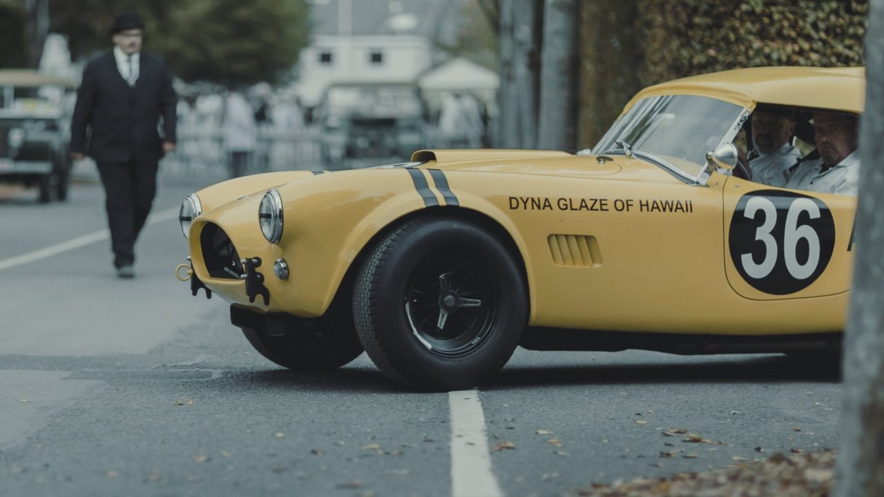
The nostalgia comes from a combination of subject and careful colour grading. I tend to have a rough idea of where I want to take a collection of images before I start but inevitably things evolve. I try to start from scratch in terms of colour grading with each shoot, I don’t want to all my images to look the same. It’s this reason I never use off the shelf filters or presets in my post production.
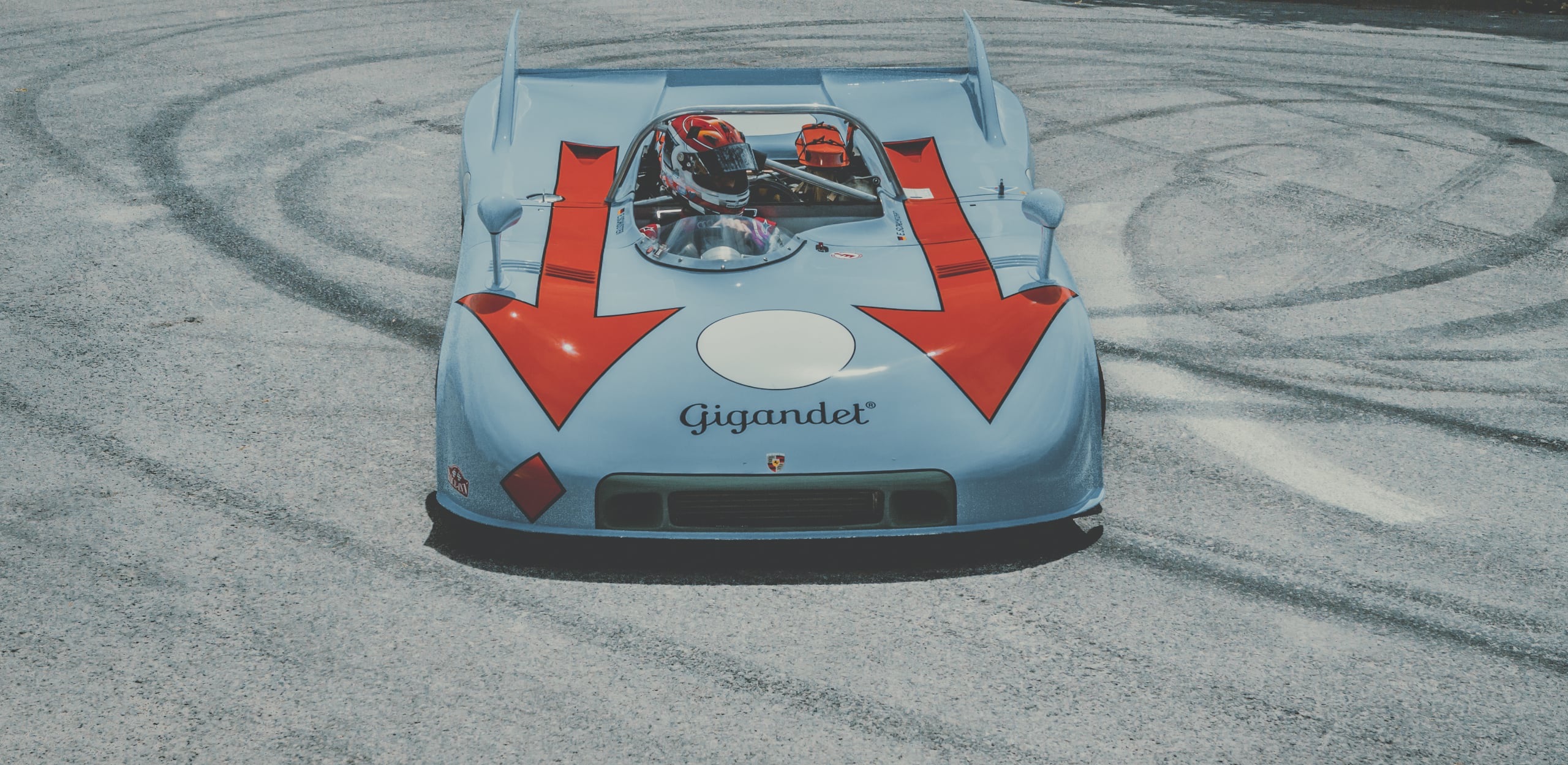
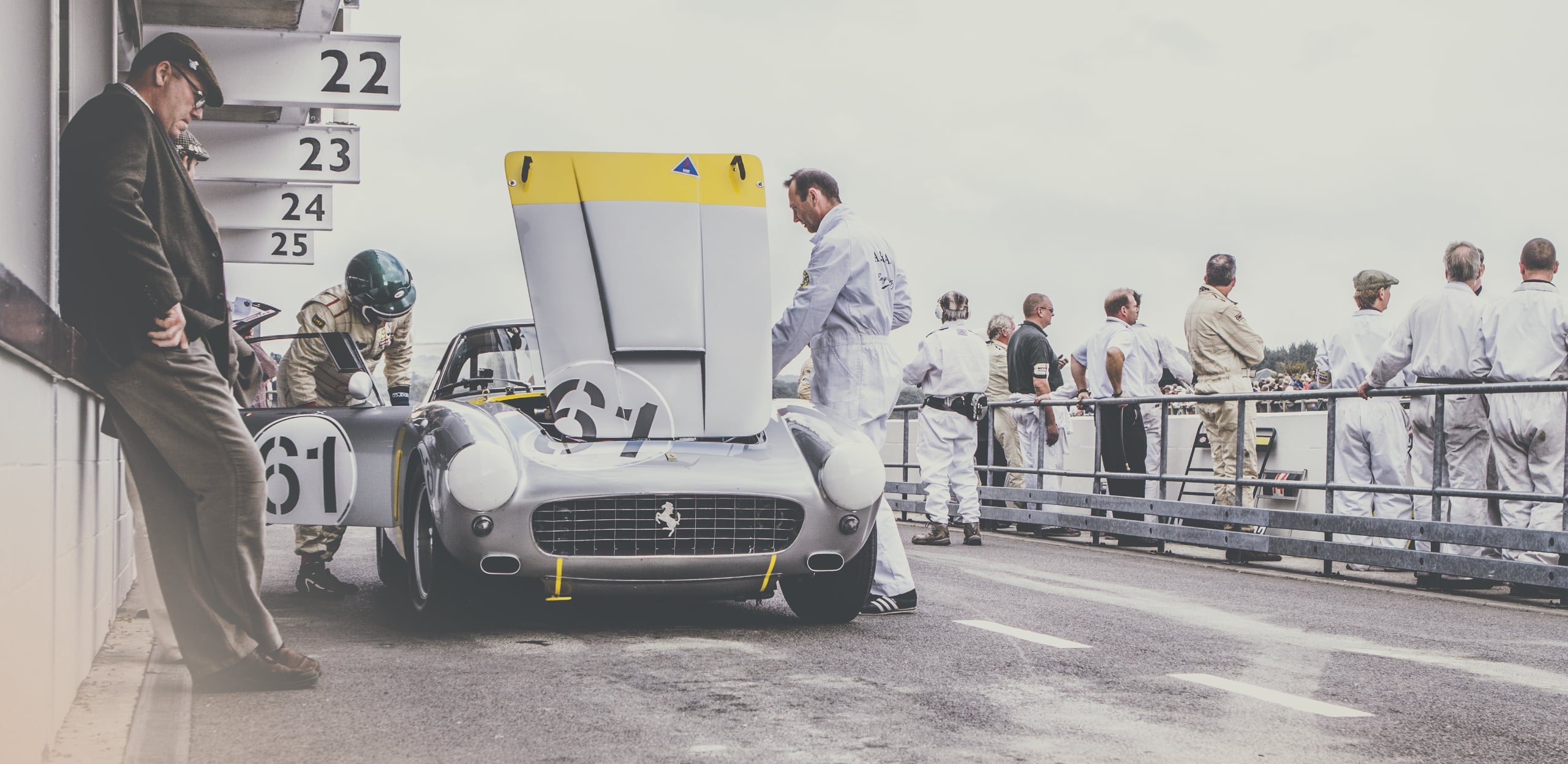
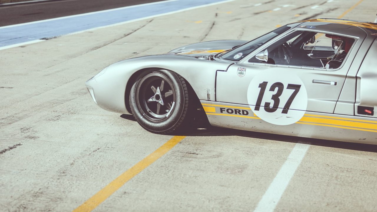
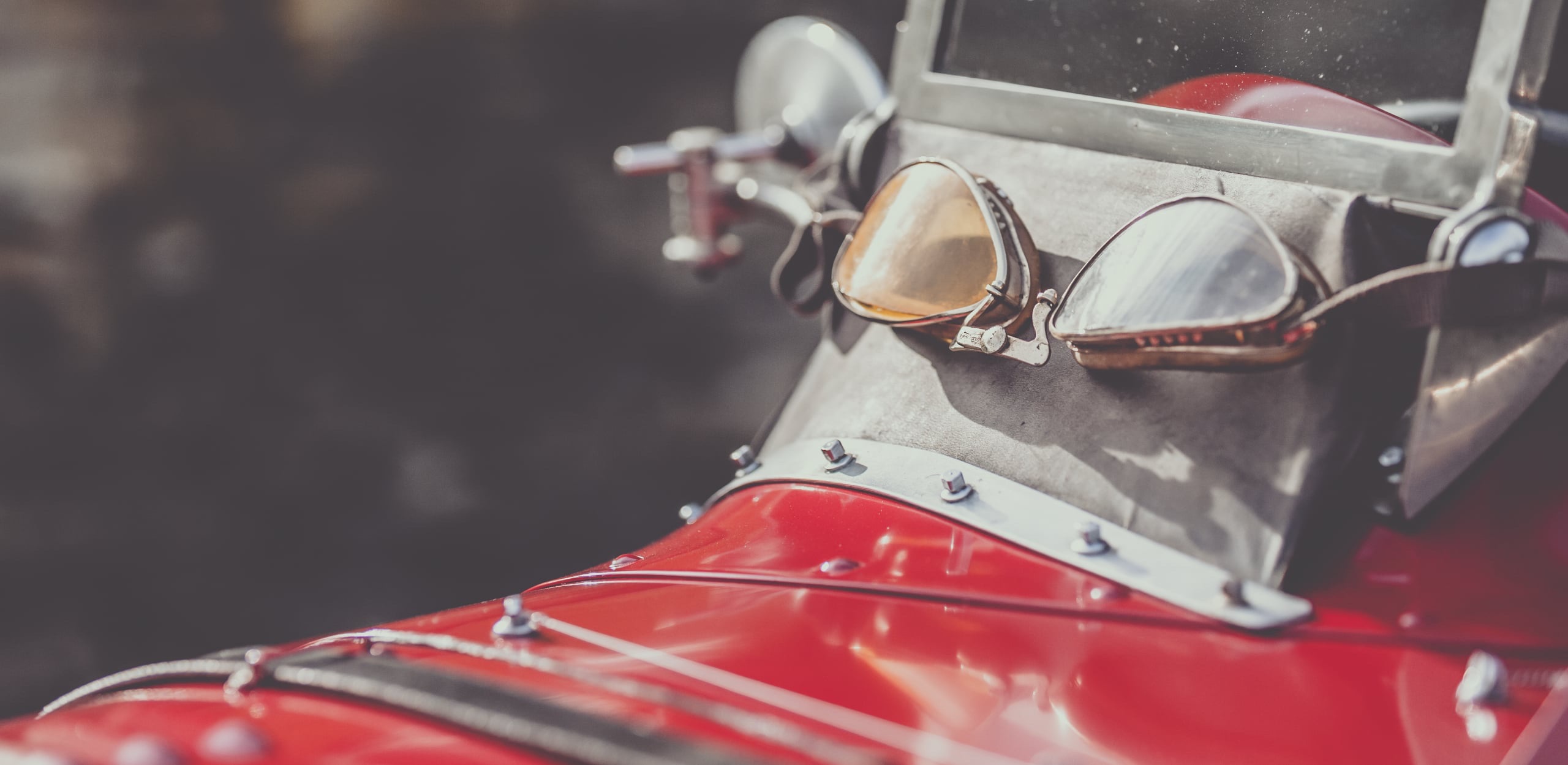
I prefer images that tell a story, freeze time or evoke an emotion. There are many contributing factors to this but being in the middle of the action is the biggest. Most importantly though, these machine’s were made for a purpose, that purpose is to be used so the interaction between human and machine for me is an important factor that I feel is often a missed opportunity. Human nature dictates that we’re automatically drawn to a person, if we see their face we instinctively try to recognise the subject. If you see their eyes you’ll go straight there, if they’re not looking at the camera the viewer will try to next look at what they’re looking at. It’s an interesting way to think of an image in terms of composition. If there is no human element I try not to shoot the obvious angles, instead I like to consider the form and capture a detail forcing my viewers to really look at the design. I tend to treat these in a more graphic way leaving plenty of empty space in frame so as not to detract from the machines form. Light plays a big part in the composition of these shots.
“Most importantly though, these machine’s were made for a purpose, that purpose is to be used so the interaction between human and machine for me is an important factor that I feel is often a missed opportunity.”
I like to shoot in a way that allows me to really dictate what my viewer looks at in an image. It forces the viewer to engage with the subject. I found my way there by looking at fashion and lifestyle photography. The colour grading is inspired by my love of vintage film stocks and the way they shift when processed using different chemicals. I try to be sympathetic in my choice of colour pallets to the period in which the machine is from.
A sense of nostalgia, a blend of technical and optical progression with the romance and evocative nature of film from the past.
The creative freedom to explore and experiment new techniques and processes without being afraid of making mistakes is very refreshing, almost liberating. In fact positively embracing what most consider mistakes and taboo’s to make something unique, engaging and atmospheric.